Client Feedback On The Creation Of The Earth
Working in advertising, I’ve become familiar with the phrases common in client feedback, and have even shamefully used them myself. I started playing around with these phrases, and decided they’d be funniest when applied to the most complex, awe-inspiring, and impossible-to-revise project in history: the Earth.
Originally published on McSweeney’s Internet Tendency. Full text below.
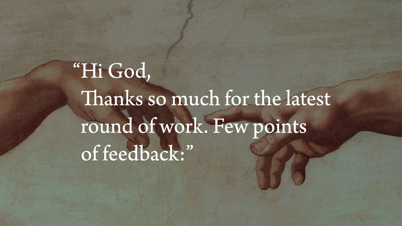
Hi God,
Thanks so much for the latest round of work. Really coming together. Few points of feedback:
1 - Really liking the whole light thing but not totally sure about the naming system. “Day” and “night” are OK but we feel like there’s more we can do here. Thoughts? Definitely need to nail this down ASAP.
2 - Re: the “sky”… not really feeling the color here. Would like something that pops more. Please send additional options.
3 - Appreciate the work on the sea and ground, but right now there’s way too much sea. The ground is getting lost in it. In general, sea does not resonate well with our users. Was talking with the team and the idea of having no sea at all came up. Thoughts?
4 - Noticed you’ve covered the ground in vegetation bearing seeds according to their kind and trees bearing fruit according to their kind. Is this intentional? Please advise.
5 - Right now we’re only seeing two great lights in the sky… a greater one for day and a lesser one for night? Thinking that maybe we weren’t clear in the original briefing. Definitely need more than just two great lights. Need to make this a memorable, high-value experience for our users. Please revisit slides thirteen and fourteen in the deck. Shout with questions.
6 - Seas teeming with life is fine, but again, we need to reduce the sea. This is a showstopper for us.
7 - Are the winged birds final, or placeholder? Some kind of weird stuff going on with those. Just want to get some clarification before giving more feedback.
8 - Can we get more livestock and wild animals that move along the ground according to their kinds? Again, the passion points for our target users (slide eighteen) are ground and animals that move along the ground. Whatever we can do to increase the amount of ground will go a long way toward converting our users from passive consumers into brand evangelists.
9 - Re: “mankind.” Interesting take on the brief here. Big pain point is that mankind is coming across as largely made in your image. As you hopefully recall from the deck, our users are a diverse group (slide twenty-seven) and we definitely want to make them feel represented (slide twenty-eight). Afraid that if our users see fleshy bipedal mammals positioned as “ruling over” the ground and sea (if we’re having sea), they might feel alienated and again less willing to convert into brand evangelists. Let’s fast-track an alt version with mankind removed. Doable?
10 - Please cut all the “be fruitful and multiply” stuff. We’re a family brand and this doesn’t fit with our voice (slide thirty-four).
Realize it’s Saturday and you were planning to be OOO tomorrow to admire your creation and everything, but I’m hoping you can keep rolling on this through the weekend. Need to get this in front of my exec team by EOD Monday so hoping to sync up EOD Sunday. Will be around all weekend via email and chat if anything comes up. Looking to you and your team for a big win here.
Thanks!
Mike
Please consider the environment before printing this email

